This past quarter I took Programming R for Analytics at Heinz. It was arguably one of the best courses that I have taken here. Programming R actually taught me to program (shocker) and gave me an appreciation for the art. Now I am self studying python and I plan to learn even lower-level (more complex) languages in the future.
Anyway, for Programming R we had a final project and our task was to answer the following question with data from the NLSY – 1979 cohort: Is there a significant difference in income between men and women? Does the difference vary depending on other factors (e.g., education, profession, criminal history, marriage status, etc.)?
This was quite a daunting task. I found myself asking: Where am I supposed to start? What did my professor want from me? Why is this blank R script so intimidating?
Because there were no specific requirements, I decided to approach the project entirely from a data viz perspective. My economist friends are probably shuddering over this decision, but I will explain why later. First, I will present my thought process on tackling this behemoth of a project. Then, I will present some of my graphs. After that, I’ll discuss the limitations and benefits of my results.
I decided to limit the scope of the project by focusing on wage discrimination by industry and gender. To do this I asked the following questions:
- Do the top earning industries differ for males and females?
- What is the difference in pay between the top earning industries for women vs. men?
- What is the “within” industry difference in pay between women and men?
- Is there a visual trend between the mean salary of the industries and the difference in wage between women and men?
Before I conduct any sort of analysis I had to do a lot of data cleaning. The NLSY posts very raw data sets. Everything is coded numerically and a user must recode the data using a key provided with the data set. In a subsequent post I will share my procedures for data cleaning.
Findings and Visuals:
Question 1: Do the top earning industries differ for males and females? Yes! As seen below the top earning industries for female are Armed Forces; Professional, Science, and Tech; Educational Services; Finance & Insurance; and Wholesale Trade, respectively. While the top industries for males are Finance & Insurances; Profession, Science, and Tech; Information; and Educational Services. There are three intersecting industries: Professional, Science and Tech; Education; Finance and Insurance. This can imply wage discrimination in top male industries or that females and males simply accept roles with differing salaries in the two fields.
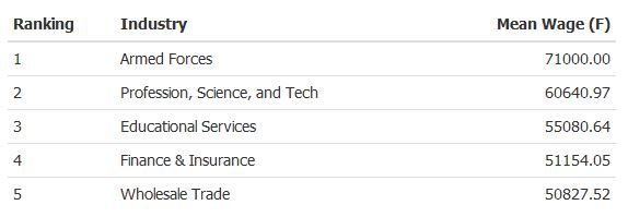

Question 2: What is the difference in pay between the top earning industries for women vs. men? I created the following dot graph for a clean simple look. I was hoping to exploit negative space to show the dramatic disparities. The graph captures the difference in average wage in the top earning industries (note: the top earning industries for men and women do not align). Most notably, the top earning industry for women earns them $71,000 while the top earning industry for men earns them $188509.20. This is a huge disparity in earnings. Interestingly, the gap seems to widen as the rank of industry increases.

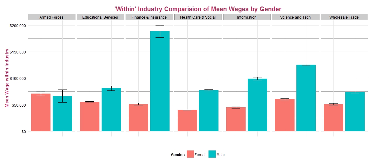
Question 3: What is the “within” industry difference in pay between women and men? For the following graph I decided to create a simple, yet complex bar graph. Through dodging and faceting, I can cover multiple dimensions of data one graph: mean wage, gender, and industry. The graph compares the female and male wages in top industries. Interestingly, there is a vast disparity between female and male wages and salaries in the finance and insurance. There are also pronounced differences in information and professional, science, and technology. Interestingly, armed forces is the only industry in the top industries for males and females in which females receive higher salaries and wages on average. However, this is a deceptive conclusion as show by the standard errors. We cannot conclude that the difference in Armed Forces wages is statistically significant. Thus, in none of the top industries are women paid more than men and in the vast majority of them, woman receive lower wages.
Question 4: Is there a visual trend between the mean salary of the industries and the difference in wage between women and men? There does seem to be a visual trend when comparing the difference in earnings to the industries when they are ordered by mean salary. As mean salary of the industry increases, the disparity between male and female wages also increases. However, taking the standard error bars into account yields a different interpretation. If the standard errors range contains zero (noted in red), the differences between industry wages may not be statistically different than zero.
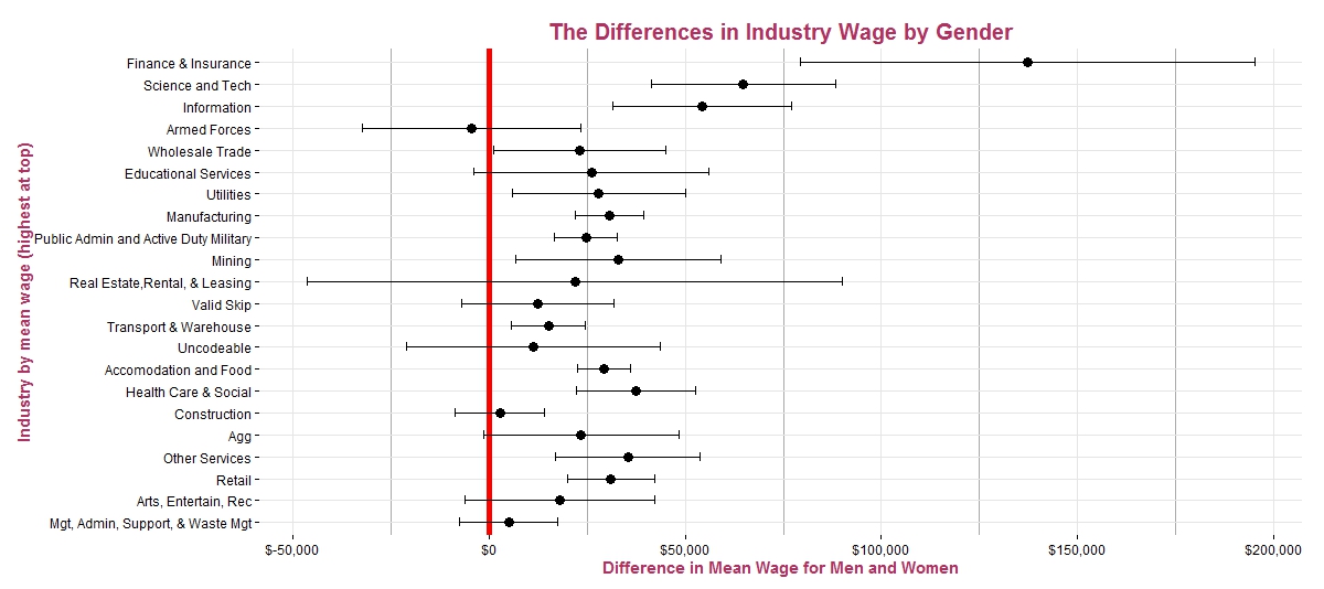
Thus, I created another graph with only the values that do not contain zero in their standard error range. After disregarding the industries with zero in their standard error range, I cannot confidently say that there is a clear relationship between mean industry wage and disparity between male and female wages. In the top three industries, males clearly earn more than females, but there is a lot of noise in the relationship between wage salary and difference in mean wages for the other industries.

Concluding Remarks
I find that there are significant differences in income between males and females on a superficial levels. However, broken down by industry, top earning female industries still yield lower wages than top earning male industries. In some cases the disparities are huge like in the financial, technology/science; however, in other industries the interpretations are not as clean cut, because of large variations in wage.
The most lacking part of my project was in the ‘analysis’ aspect. All of my answers are based on descriptive statistics and from this we cannot tease out any sort of causality. An economist might even scoff because of lack of ‘analysis’. (S)he may ask for various statistical tests and the regression specifications; however there are some distinct advantages to not conducting these analyses. With my approach, I limit the ability to make assertions regarding larger populations, but I also limit the assumptions needed for my findings.
Geek Speak:
- In ordinary least square regression (a popular method for test hypotheses in the social sciences) to gain consistent estimates we want a rather large sample size. With a sample size over 5000 (that of the NLSY data), we usually assume consistency (as the number of observations increases, the probability that the estimated mean salaries converge to their “population” mean salaries approaches 100%) and asymptotic normality (large sample sizes lead to the underlying distribution of our estimator (mean salary of our data set) being normally distributed about the population statistic (mean salary of a larger population). However, the “within” industry sample sizes can be quite small, so small that we would not expect them to reach Asymptopia (the mythical land of consistent estimation where the mean wages from our data set are equal to the mean wage in the actual labor markets). Thus, we would have to assume that the estimates of mean salary from the included observations are representative of population mean salary and that is a non-trivial assumption.
- Even if we make that hefty assumption that the means would be consistent estimators, we couldn’t even bootstrap (or conduct any other method of simulation) for consistent standard errors because of the severely limited sampling in quite a few of the industries. Without consistent standard errors, there is no context to the means because we cannot verify whether differences are statistically significant. Standard errors can change the interpretation of a finding, as shown above.
Real Talk:
- We can’t possibly postulate that our results are representative of a larger population unless we make rather grand assumption. We just don’t have enough samples for certain industries!
- We can’t be confident in precision of our findings if we do not have a clue about the variation.
